Inconsisten use of google badge
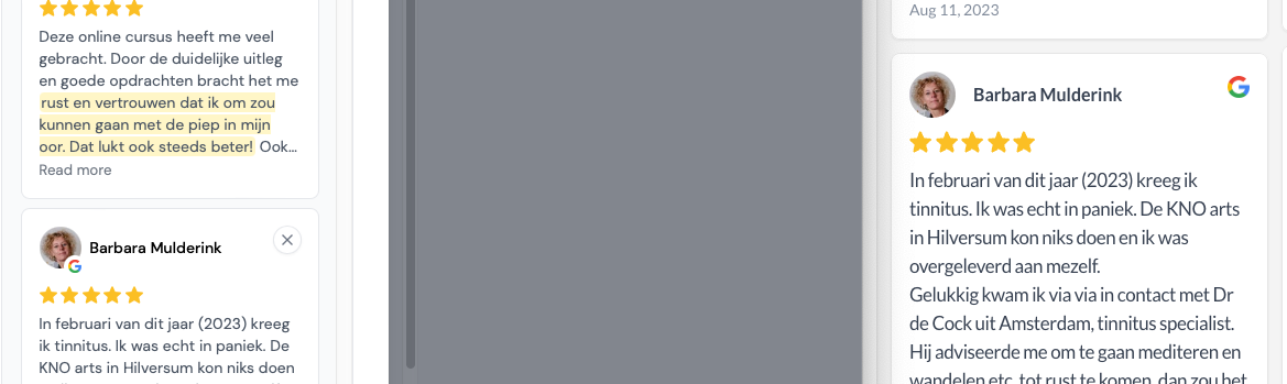
When 'selecting testimonials' in a grid widget you see nicely the customer google photo with a google icon on it. But on the wall itself, you see the customer photo on the left, and then a separate large google icon on the right. It would be much cleaner to show the same as during testimonial selection. Customer photo with small google icon ON it.
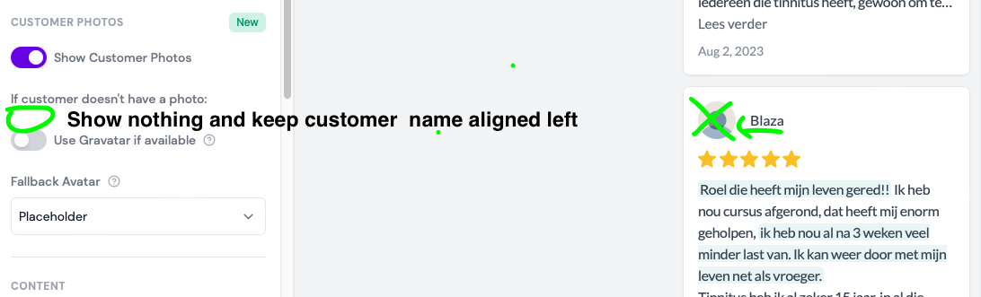
Furthermore it has been a while back since I requested to have NO customer avatar if nothing is available and keep customer name aligned left. Maybe this will be ugly if you have a review right above it which does have a customer avatar, so then maybe you could place the customer avatar on the top right corner if available, and always keep the customer name aligned left.
Also, I would like to be able to change the color of the badge when the customer has a google review, but no photo on google. That color is now green but not editable.
Please authenticate to join the conversation.
Discussing
💡 Feature Request
Widget
Over 2 years ago
Roel
Subscribe to post
Get notified by email when there are changes.
Discussing
💡 Feature Request
Widget
Over 2 years ago
Roel
Subscribe to post
Get notified by email when there are changes.