🥴 Better UI/UX - Things are hard to find inside Senja right now
Hi! I have months of using Senja, I love it. Nevertheless, today I spent 3-4 minutes searching for my own Wall of Love.
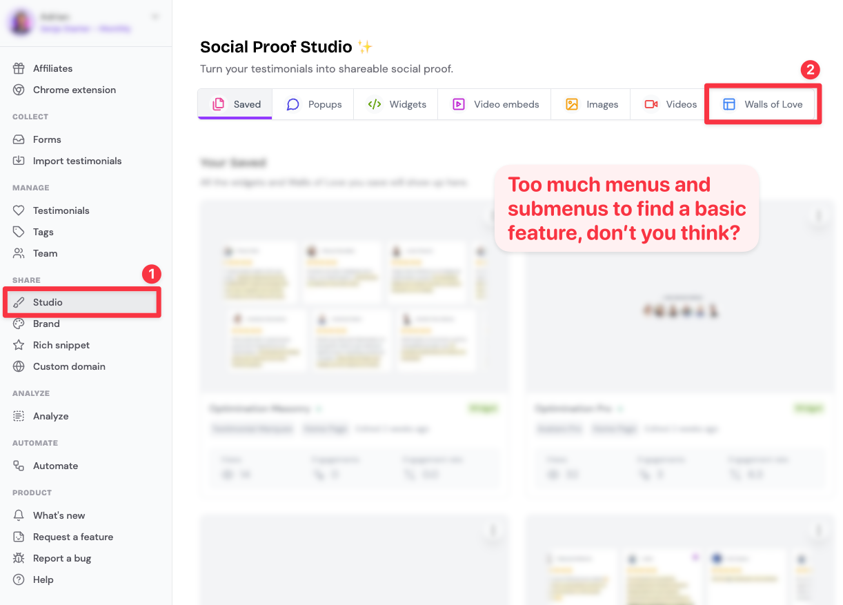
I would thought this feature is so key that it would be easy to find it on the main screen inside my account. Instead, I had to navigate +10 menu options.
Walls of Love are hidden as the 7th and last widget inside the 8th menu option on the left.
This has also happened before when trying to find previous widgets. This can be solved by simplifying the menus. Right now the website is giving too much focus on secondary features (like tags and team, literally above the studio/widgets, that are the most important features).
Suggestion: 1 main menu on the top with only the most clicked menus (you should have this info with Google Analytics). It probably will be:
1. (To collect testimonials) Collect/Forms (import)
2. (To create widgets) Studio/Widgets (popups, images, videos, walls of love)
3. (To manage testimonials) Manage (edit, tags, highlights, photos…)
This would even give a logical order to how to work inside Senja.
All the other features and menus could be on the footer or shown only if you hover over a menu symbol.
Again, Senja is great! But right now the home screen is just overwhelming. It should be a lot more intuitive and easy to use. 🙏🏼
Please authenticate to join the conversation.
Discussing
💡 Feature Request
Almost 2 years ago

Adrian
Subscribe to post
Get notified by email when there are changes.
Discussing
💡 Feature Request
Almost 2 years ago
Adrian
Subscribe to post
Get notified by email when there are changes.