Homepage feels quite scammy now...
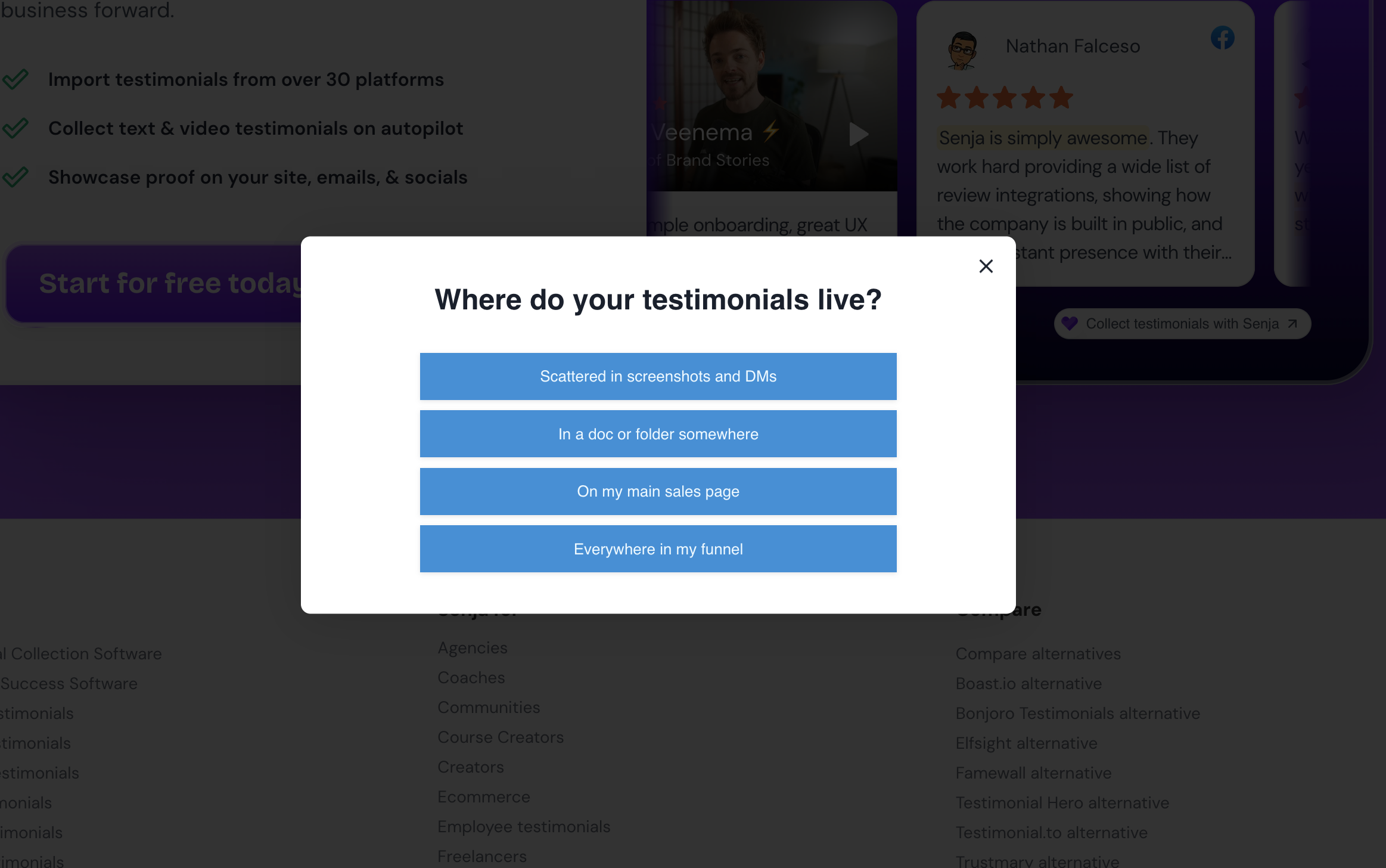
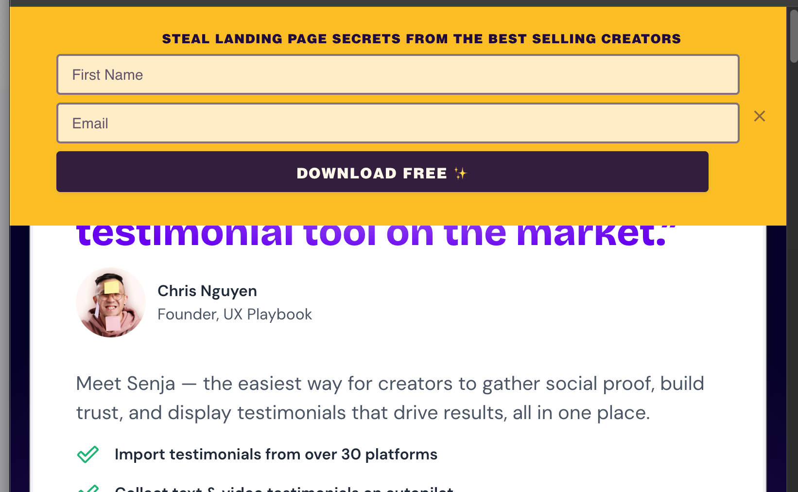
I appreciate that every homepage needs to convert as much as possible, but every time I go to the Senja homepage, I’m confronted with different pop-ups, widgets and clear “conversion-optimisation” techniques.
It feels, for want of a better word, a bit scammy?
I’ve been a customer for a long time and am happy with the product, but it just feels like the brand has been really cheapened in the pursuit of conversion optimisation.
Maybe this homepage is killing it in terms of new signups, but this is just my two cents as someone who has been using Senja for a while.
Log in to comment and vote
Comments1
Rani
Sep 22
Hey @Alastair
Thanks for taking the time to write this out, especially as a long-time customer.
That's fair feedback, and not the impression we want to leave.
We'll take a closer look at the homepage with fresh eyes.
Cheers,
Rani - Senja Support & Ops